
This is something that has been pressing me for quite some time. When you first get into stocks, you hear two trains of thought on how to profit in the market: technical analysis and fundamental analysis. As I learned and used both more and more over the years, I’ve come to the realization that most of technical analysis is complete crap, bologna sandwiches, fake news, not real. What I’ve found is much of it correlates with a term known as “confirmation bias.” The Wikipedia definition of confirmation bias is,
Confirmation bias is the tendency to search for, interpret, favor, and recall information in a way that confirms one’s preexisting beliefs or hypotheses
You see, technical analysis is, for the most part, pretty easy. You look at a chart, draw lines on it, find support and resistance levels, etc. You don’t have to look through earnings reports, read balance sheets, and the other burdens that come along with doing actual fundamental analysis. The straw that really broke the camel’s back for me was when I was learning about “Fibonacci retracement levels.” These are basically arbitrary lines that you draw between high and low points on a chart, and the stock is supposed to bounce off of them. A lot of the time with technical analysis, it doesn’t work. You have lets say a support or resistance level form, and then the stock goes through it. Then you start asking yourself questions:
- Was that the real support level?
- Am I in the right chart time frame?
- Was this a support break down?
All of those could be true in technical analysis land. Here’s what you have to understand, if technical analysis were real, and actually worked, many more people would be rich in the stock market. As I discuss in my free report Crush the Market, over 90% of traders don’t make one penny in the stock market. Think about all the different chart times you can look at. You have a 1 minute chart, a 5 minute chart, a daily chart, a weekly chart, etc. Then you have different types of charts. You can look at a line chart, a candlestick chart, a bar chart, etc. So which one should you be using? Which one shows the correct ascending triangle or bull flag pattern? Let me show you a daily chart of Advanced Micro Devices (AMD). I have drawn a total of 7 lines that would be considered technical analysis points. Lines 4 and 5 are considered a trend line, and the other points are considered support and resistance levels.
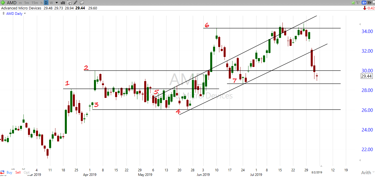
You’ll notice that the stock price is all over the place. Some of the lines it bounces off of, others it goes right through. The thing is though, the lines it bounces off of are all in hindsight. It’s easy for me to draw those lines now that I have the chart in front of me, but how about drawing lines into the future? You could say, “Yeah but look at line 6 Tim. That’s a clear triple top.” Fair enough, but again that’s in hindsight. What if it didn’t bounce off that point but instead went through it like it did line 2 earlier in the year, then what? Then you’re out a lot of money. If it hits the line it’s resistance. If it goes through it, then resistance failed. Technicians can use all the terms they want to make technical analysis seem more plausible but it’s essentially a 50/50 shot. You’re flipping a coin. The stock could go up… but it could go down. Sometimes it bounces off, sometimes it doesn’t. This same principle can apply to just about any area of technical analysis. Bull flags, triangles, trend lines, etc. It’s all the same.
And let’s not forget I’m looking at the daily chart of AMD. If I were to look at the hourly chart, or the weekly chart, these support and resistance points would be completely different. And then how far should I go back to find a technical analysis point? Should I still be using a trend line from 10 days ago? 10 weeks ago?
Let’s look at another chart, this time we’re using an ETF called SPY which correlates with the S&P 500. This is a very heavily traded ETF, and as such, many people are watching technical analysis points on it.
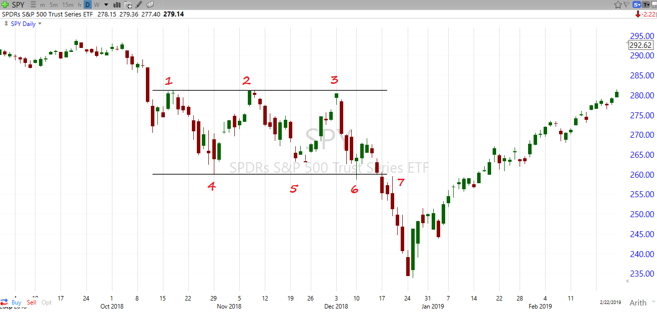
When we first take a look at this image, it appears something is going on. But remember, we are looking at this in hindsight. Going from the original support and resistance levels, there is 1 occurrence out of a total of 5 where a support or resistance level worked correctly in this chart; that would be point 2. The chart never reached point 3 or 5, and at point 6 it went below it, before quickly coming back up. Then at point 7 it completely barreled through the support level. So had you actually put in orders with this stock at points 2, 3, 5, 6 and 7, you would have been right 1 out of 5 times. That is a 20% success rate, as in worse than flipping a coin. Are you starting to see how technical analysis is bogus? And again, this is the daily chart. Had I used the hourly or weekly chart, we would have had completely different support and resistance levels.
When you put it all in perspective, technical analysis comes down to two things:
- Confirmation Bias
- Hindsight Bias
That is the gist of what is going on with technical analysis, and the reason why so many people can sell you books on the subject, as they are showing you a lot of charts and lines in hindsight that they have drawn. However when you try using these same techniques to project future events, things don’t work as they show in the textbooks. The reason I say technical analysis is 95% crap and not the full 100% is because there are occurrences where it is useful. Examples would be when a stock goes below or above it’s moving average line, when certain moving average lines cross, and identifying long term trends. However, these are mostly related to momentum, and using technical analysis just helps you find changes in that momentum. Fundamental analysis is a much better way to determine whether you should be buying or selling a stock, and has proven itself much better throughout history. You may have heard of a guy named Warren Buffett. He used fundamental analysis to make a little bit of money in the stock market.